About the client
During the year of 2016, we had the opportunity to work with a clients that wanted to expand their business and redesign the current website based on Presta Shop platform.
Goals
Website redesign and a brand creation. Since the client had a logo already and a running business we had to introduce users with a new website and brand without losing any sales or popularity.
- Website redesign according to already chosen brand colors
- Clean aesthetics
- Ability to show professionalism
Challenges
Biggest challenge that we saw was creating a custom Presta Shop theme that will run on the latest version of the system and no loss of data during the process of migration. Also, showing the users that this is not just another company that sells "something", we had the opportunity to be creative.
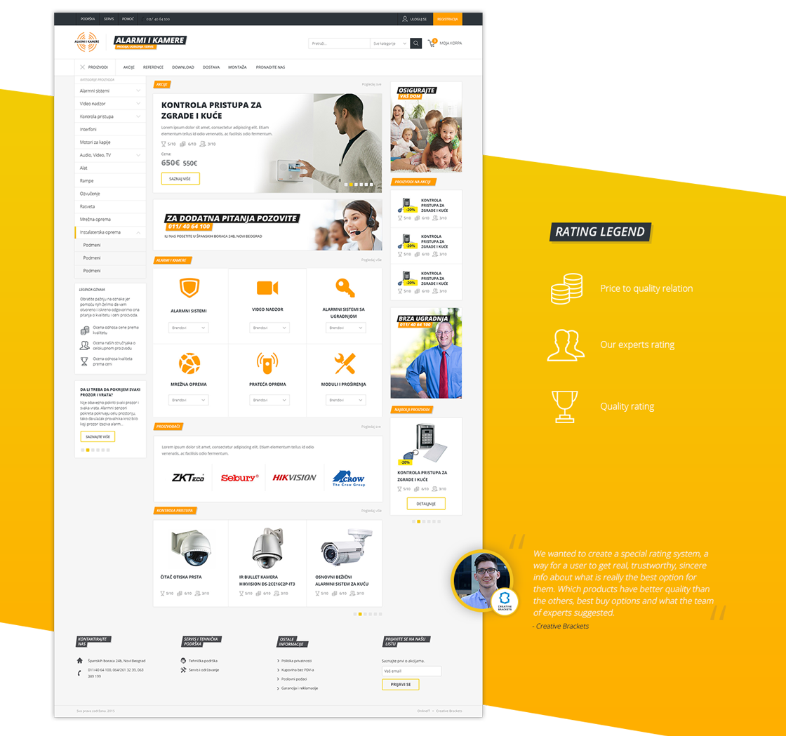
Design
Since the main color was already chosen, choosing the color pallet was a good way to start. It's probably true that Open Sans is one of the most popular fonts in 2017-th. We didn't choose it just for the aesthetics. Latin extended script was required for this client. 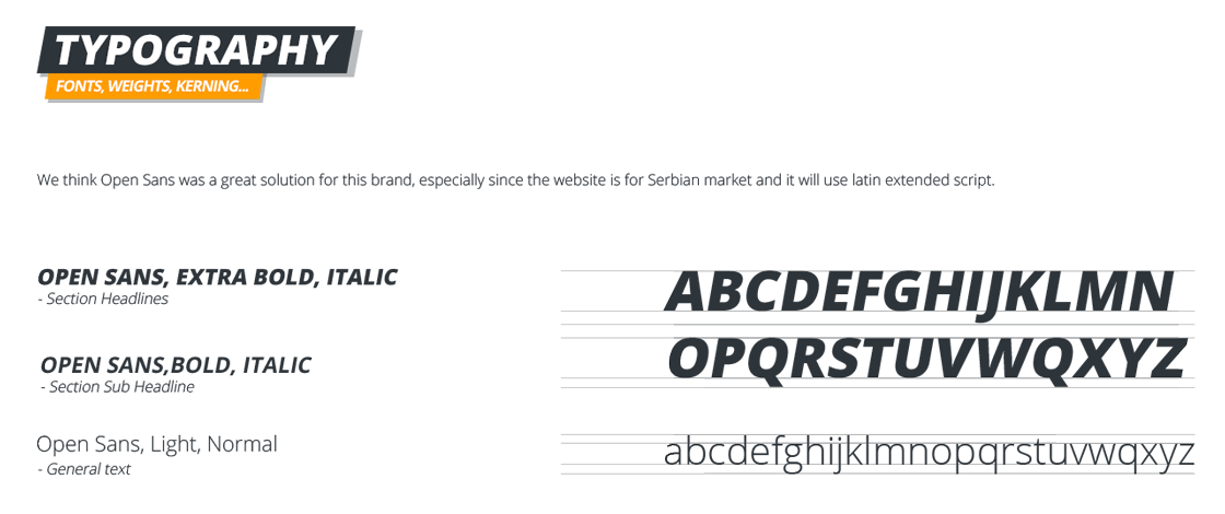
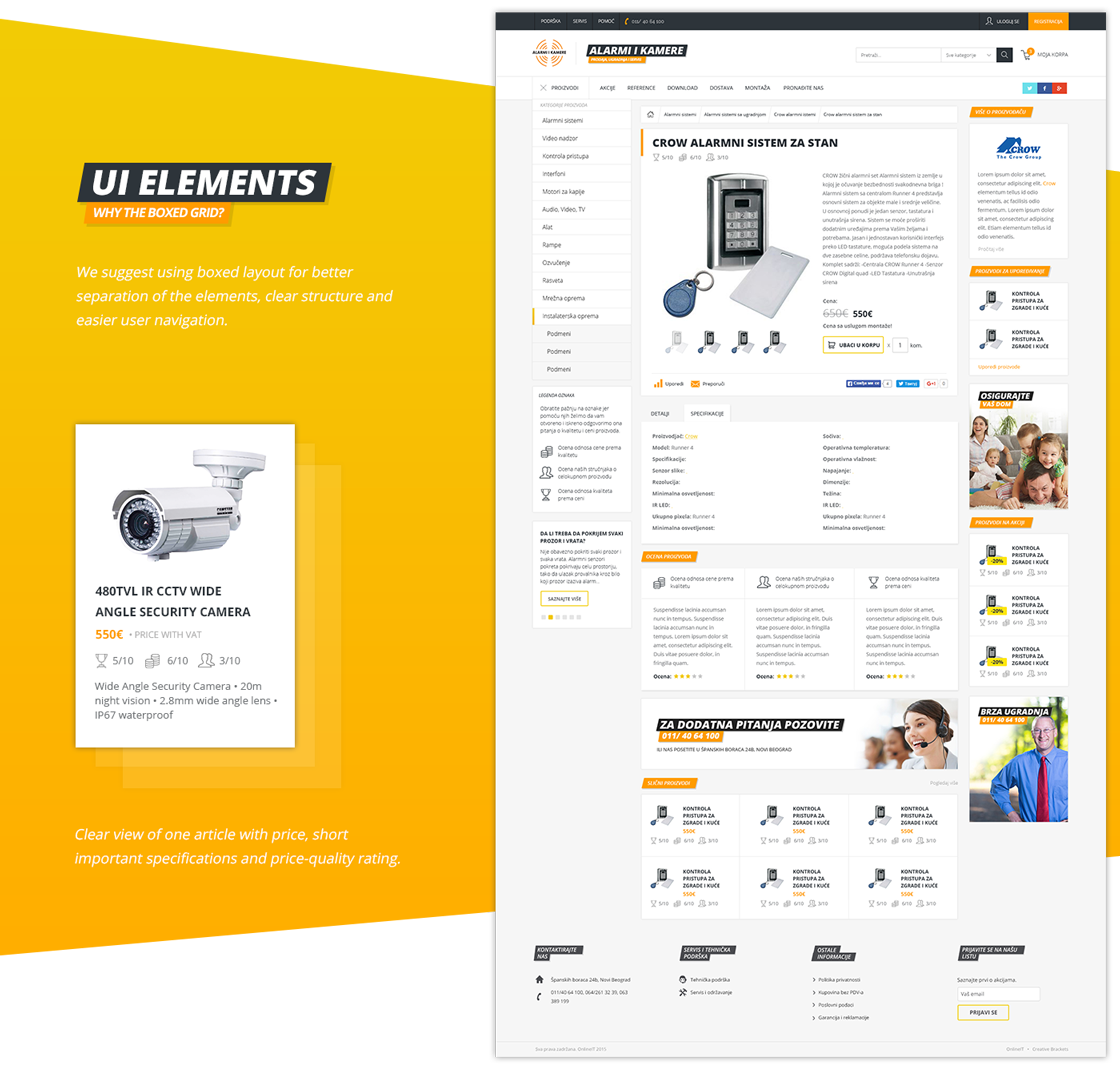
On websites that have a lot of information, especially if they are e-commerce websites we advise designers to use boxed design with a lot of white space for easier navigation and better user experience.
Result